
PTE Describe Image gives you 25 seconds to prepare and up to 40 seconds to describe a visual. Start with its subject, explain the most important features and connect them accurately. Use the seven practice images below, then compare your response with the sample and self-check.
Reviewed 20 September 2026. These are BandLadder practice visuals, not recalled exam questions or verified real-world statistics. The samples demonstrate possible descriptions; they are not officially scored answers or scripts to memorise. Images, data captions and sample answers are available without signup.
Academic vs Core scoring · Bar graph · Line graph · Pie chart · Table · Process · Picture · Map · Continue practising
How to use these Describe Image examples
- Choose an image and give yourself 25 seconds to identify its subject and main features.
- Describe it aloud for up to 40 seconds. Use your device's recorder if you want to listen back.
- Open the sample after your attempt. Compare the information covered, not whether you used identical words.
- Choose one correction, then attempt a different image so you practise selection rather than memorisation.
The timings are stated on Pearson's Academic task page and Core task page. In the test, begin after the recording tone. These article exercises provide sample-based self-review; recording and AI practice feedback are available through the platform links below, subject to your access.
Describe Image scoring: Academic and Core are different
The current PTE Academic Score Guide lists Content on a 0–6 scale, Pronunciation on 0–5 and Oral Fluency on 0–5. Describe Image contributes to Speaking. Content receives both automated and human review; a zero Content result means the response earns no score points.
The PTE Core Score Guide uses Content 0–5, Pronunciation 0–5 and Fluency 0–5 for this task. It also contributes to Speaking. Do not apply the Academic content scale to Core.
Adding the trait maxima does not give you a formula for the final 10–90 Speaking score. A “16-point” or “15-point” checklist is not a percentage weighting, and improving one raw trait by one point does not imply a one-point change in your reported score. Use our PTE score-report guide for the distinction between task feedback and a full report.
A flexible answer structure
Subject → key features → relationships → summary. For example, identify what a chart measures, compare its strongest features and close with an overall pattern. For a process, follow the arrows. For a picture, organise the main scene and visible details. This is an organising method, not a fixed script.
During preparation, check the title, units, legend and time period. Select a few connected points that explain the image. Avoid adding an invented cause, location or prediction merely to sound analytical. A statement such as “sales fell after the peak” can be supported by a line graph; “sales fell because the market was saturated” needs evidence the graph may not provide.
1. Bar graph: compare categories
Identify the largest and smallest bars, then compare the middle group. The country names below belong to an illustrative dataset; these values are not an energy-policy reference.
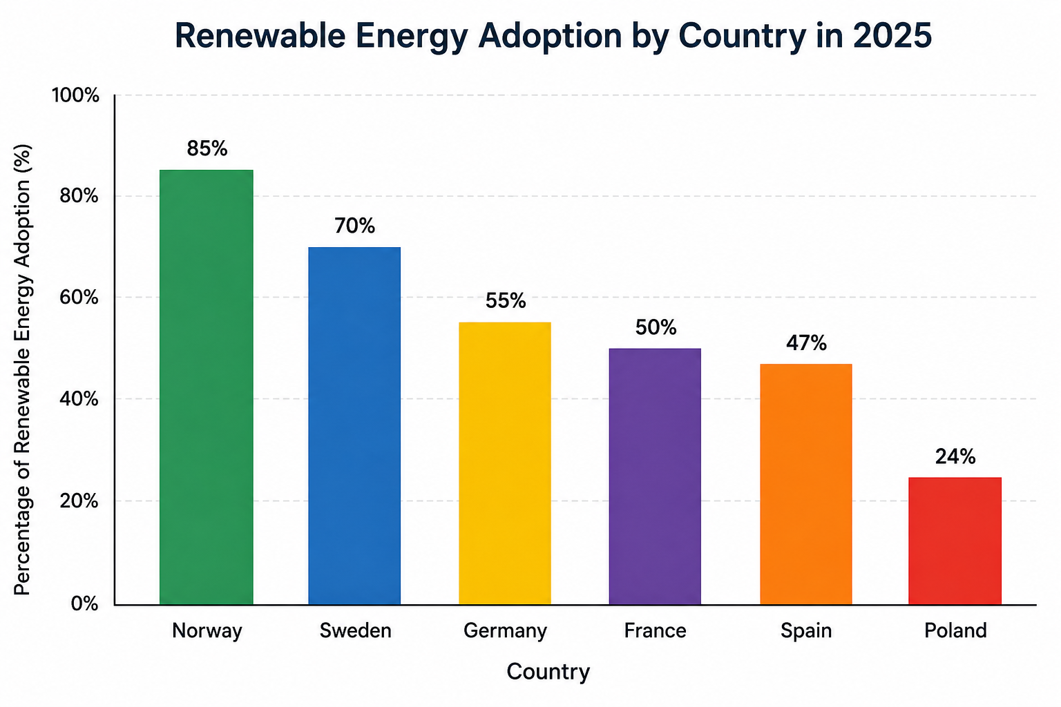
Image data: Norway 85%, Sweden 70%, Germany 55%, France 50%, Spain 47%, Poland 24%. The chart is labelled renewable energy adoption in 2025.
Reveal the bar-graph sample and self-check
“The bar chart compares renewable energy adoption in six countries in the practice dataset for 2025. Norway has the highest figure at 85 percent, followed by Sweden at 70 percent. Germany, France and Spain form a middle group between 47 and 55 percent. Poland is lowest at 24 percent, leaving a gap of 61 percentage points between the highest and lowest values. Overall, the figures vary considerably across the six categories.”
Check: did you identify the highest and lowest categories and make a comparison? The gap is 61 percentage points, not a 61 percent relative increase. The image does not explain why the countries differ.
2. Line graph: explain change over time
Find the starting value, peak, turning point and final value. Describe the sequence rather than every point.
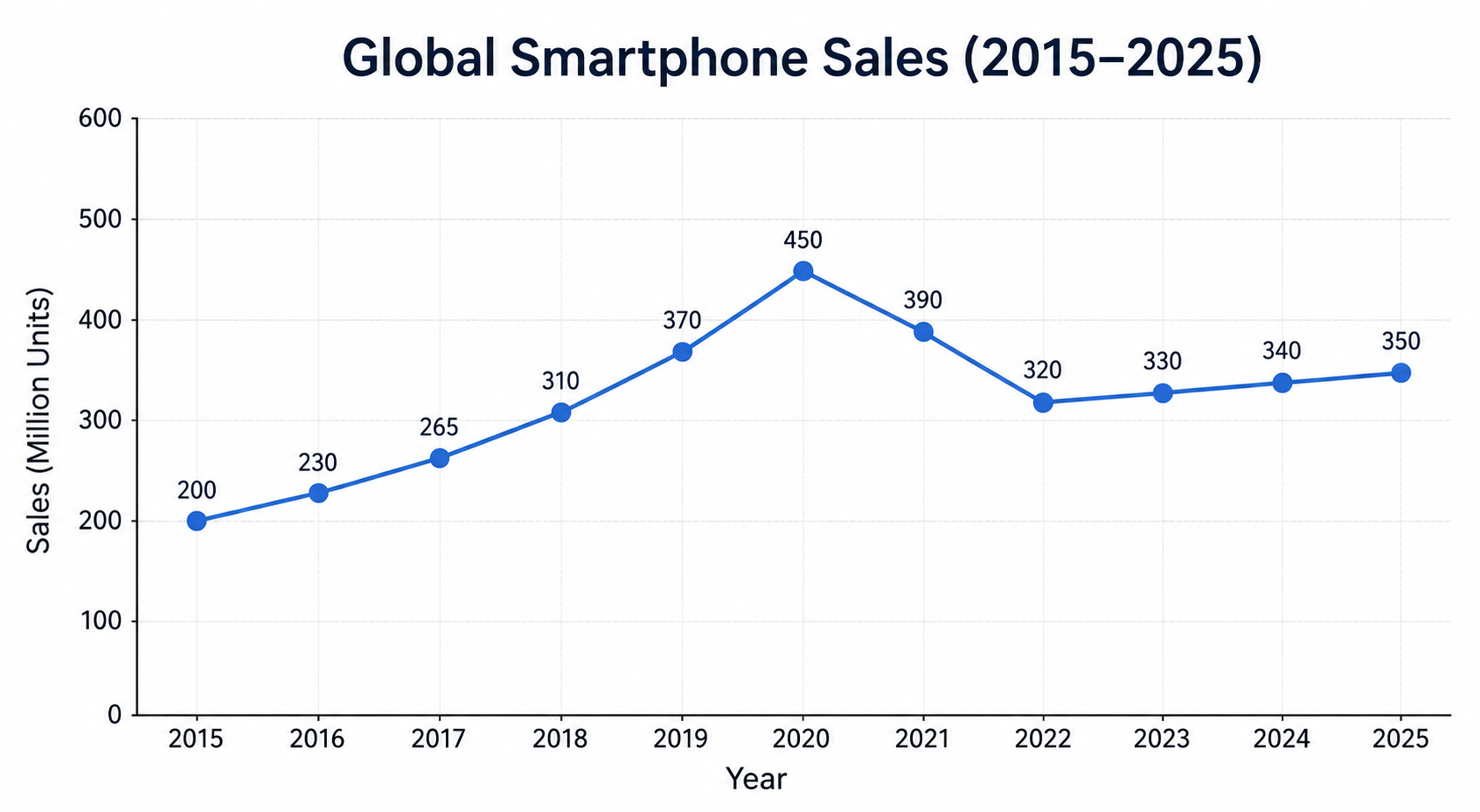
Image data, million units: 2015: 200; 2016: 230; 2017: 265; 2018: 310; 2019: 370; 2020: 450; 2021: 390; 2022: 320; 2023: 330; 2024: 340; 2025: 350. These smartphone-sales figures are illustrative.
Reveal the line-graph sample and self-check
“The line graph shows smartphone sales from 2015 to 2025 in the practice dataset. Sales rise from 200 million units to a peak of 450 million in 2020. They then fall to 320 million by 2022, before increasing gradually to 350 million in 2025. The final figure remains below the peak but is 150 million higher than the starting value. Overall, the period contains an initial rise, a decline and a smaller recovery.”
Check: did your answer include both the mid-period reversal and the net increase? Avoid calling the whole period a steady rise or inventing a reason for the fall.
3. Pie chart: compare shares of a whole
Read the category labels and units, then compare the largest and smallest shares.
Image data: heating and cooling 42%, water heating 18%, appliances 15%, lighting 10%, miscellaneous 15%. Total: 100%. Fictional household-energy data.
Reveal the pie-chart sample and self-check
“The pie chart divides household energy use into five categories. Heating and cooling account for the largest share at 42 percent, while water heating represents 18 percent. Appliances and miscellaneous use have equal shares of 15 percent each. Lighting is the smallest category at 10 percent. Together, heating and cooling plus water heating account for 60 percent of the total. Overall, these two categories make up a majority of the energy use shown.”
Check: did you notice the equal 15-percent shares? Do not introduce an electronics category: the image does not label one. A pie chart showing one total does not establish a trend over time.
4. Table: select patterns instead of reading every cell
Read the row and column headings first. Compare a consistent leader with a contrasting pattern.
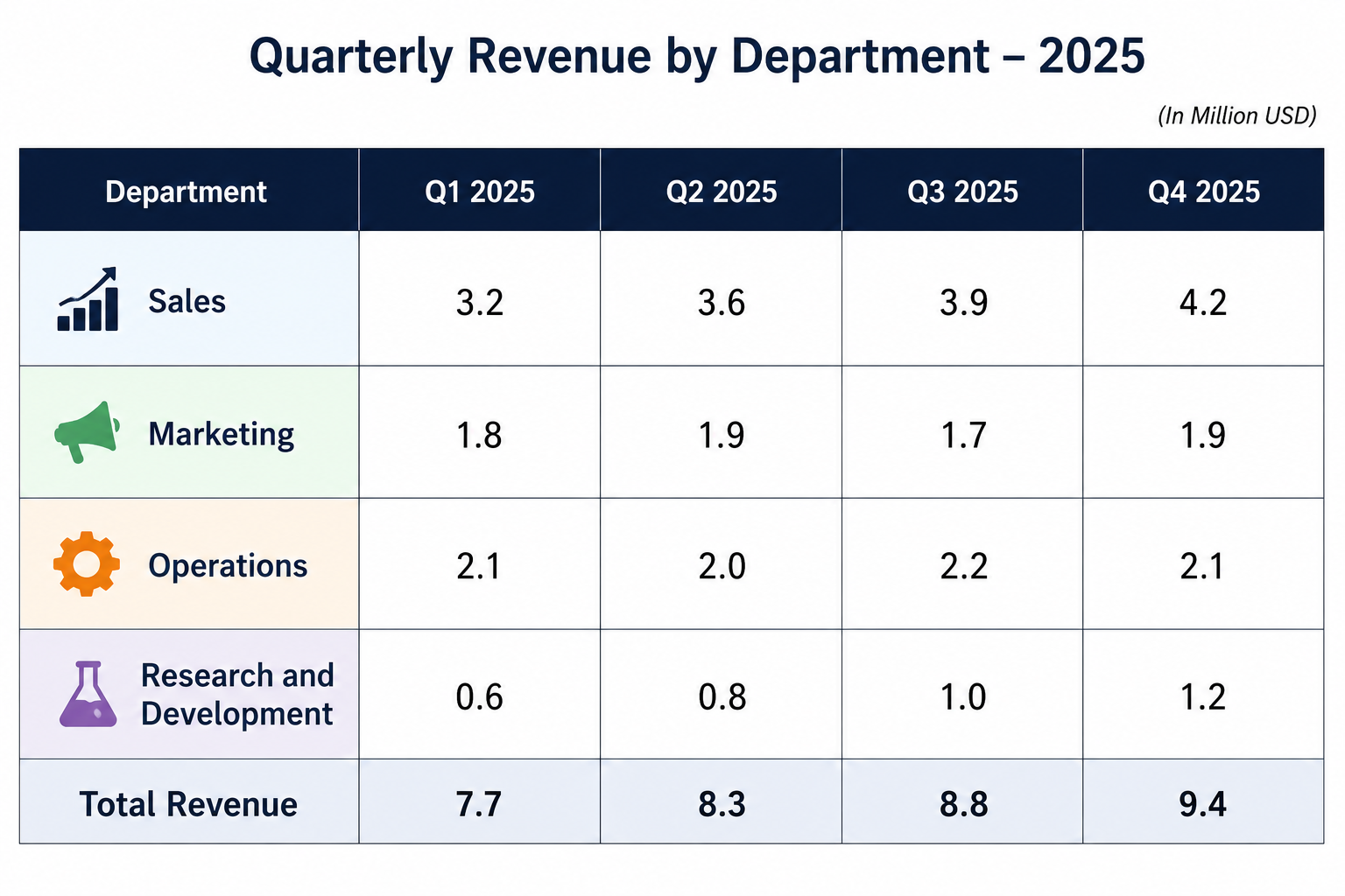
Image data, Q1 → Q4 in million USD: Sales 3.2, 3.6, 3.9, 4.2; Marketing 1.8, 1.9, 1.7, 1.9; Operations 2.1, 2.0, 2.2, 2.1; Research and Development 0.6, 0.8, 1.0, 1.2. Quarterly totals: 7.7, 8.3, 8.8, 9.4. Fictional company data.
Reveal the table sample and self-check
“The table compares quarterly revenue for four departments in 2025. Sales generates the largest amount in every quarter, rising from 3.2 to 4.2 million dollars. Research and Development has the smallest figures, but its revenue doubles from 0.6 to 1.2 million. Marketing and Operations change only modestly. Total revenue increases each quarter, from 7.7 to 9.4 million dollars. Overall, the table shows rising total revenue with different growth patterns across departments.”
Check: did you distinguish the largest absolute revenue from the department whose revenue doubles? The table does not establish investment returns or explain the causes of growth.
5. Process diagram: follow the sequence
Use the arrows and named stages. Explain what changes between the beginning and end.
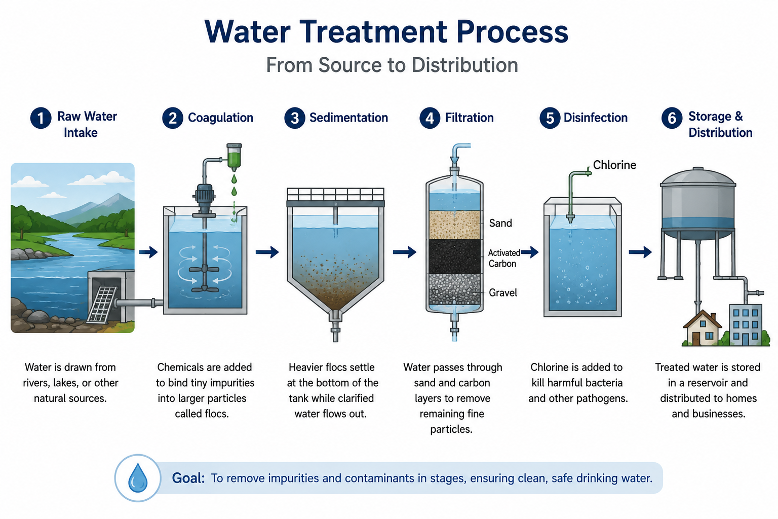
Image sequence: raw water intake → coagulation → sedimentation → filtration → disinfection → storage and distribution. This is a simplified practice illustration.
Reveal the process sample and self-check
“The diagram presents six stages of water treatment. It begins with raw water intake, followed by coagulation, where chemicals help bind impurities together. During sedimentation, heavier particles settle. The water then passes through filtration before chlorine is added at the disinfection stage. Finally, treated water is stored and distributed to homes and businesses. Overall, the diagram shows a sequence that moves from collecting untreated water to preparing it for distribution.”
Check: did you preserve the sequence and include the final distribution stage? Describe the illustrated process; you do not need to add technical stages absent from the diagram.
6. Picture: organise visible details
Start with the main scene, then move through foreground and background. Do not invent names, a city or people's intentions.
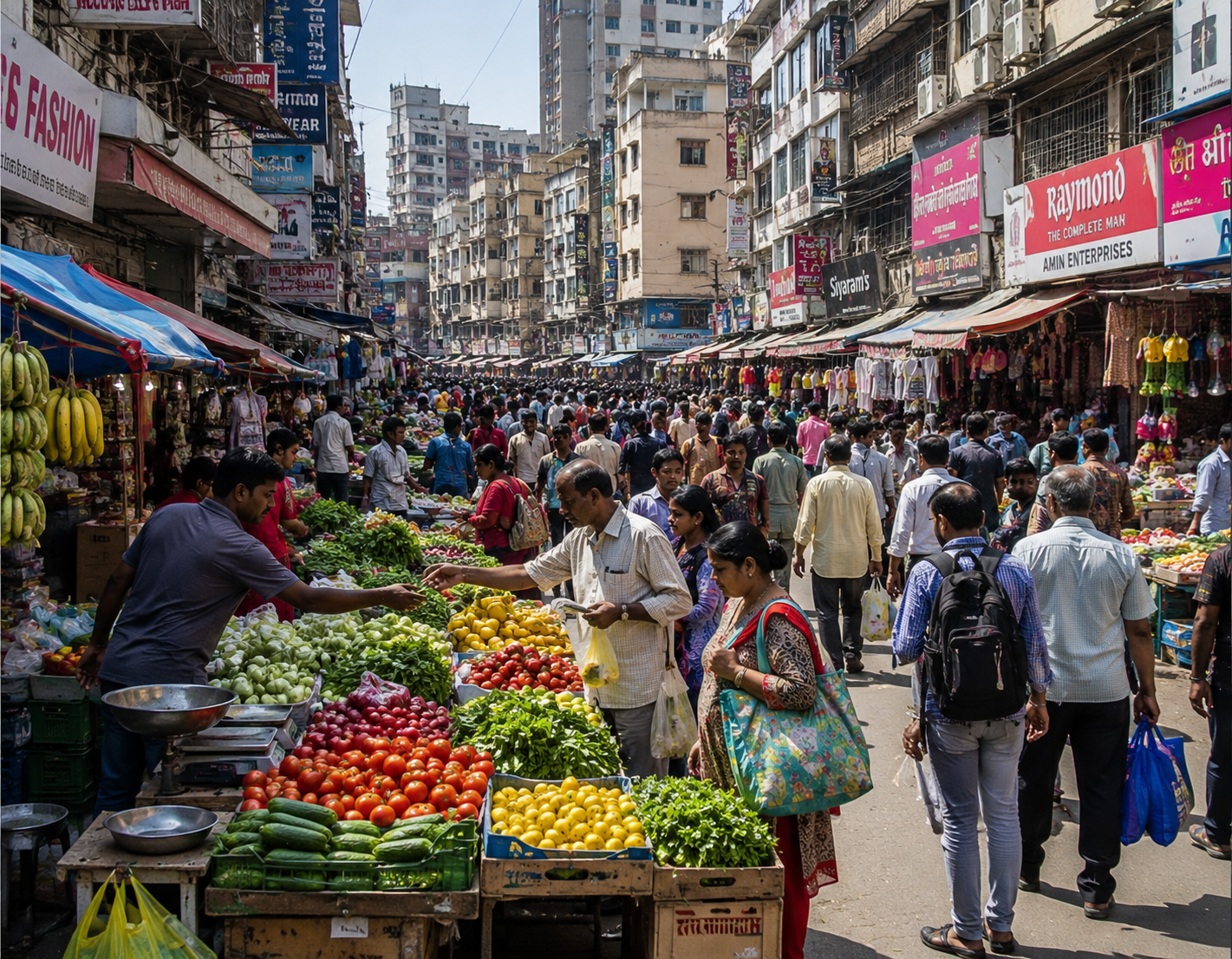
Visible scene: a crowded market street, produce stalls in the foreground, people walking or standing beside stalls, shop signs and multi-storey buildings behind them.
Reveal the picture sample and self-check
“The picture shows a busy market street with people and stalls extending into the distance. In the foreground, vegetables and fruit are arranged on both sides of the walkway. Several people stand beside the produce, while others move through the narrow central space. Shops, signs and multi-storey buildings line the background. Overall, the scene is crowded and visually dense, with the market activity concentrated along the street.”
Check: did you connect the main scene with supporting visible details? The picture alone does not establish an exact population, income level or location.
7. Map: use the legend and location
Check the compass and symbols. Compare spatial patterns without turning symbol density into an unsupported power-output calculation.
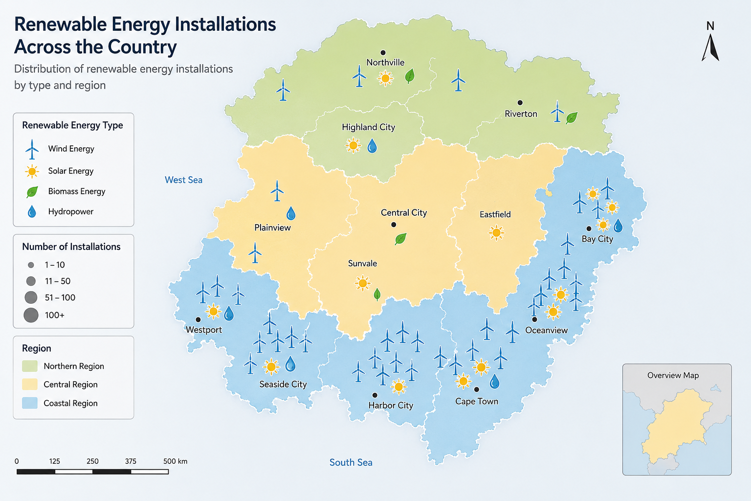
Visible pattern: a fictional country with green northern, yellow central and blue coastal regions. The legend identifies wind, solar, biomass and hydropower. Wind symbols are concentrated along the southern and eastern coastal areas; solar and other symbols also appear inland.
Reveal the map sample and self-check
“The map shows renewable energy installations across a fictional country. The legend identifies wind, solar, biomass and hydropower, while colours distinguish northern, central and coastal regions. Wind symbols are especially concentrated along the southern and eastern coast. Solar symbols appear in several regions, and biomass is also shown inland. Overall, the types are unevenly distributed, with coastal areas displaying many wind installations and inland areas showing a mixture of sources.”
Check: did you use both the legend and compass? Do not claim that one region generates the most electricity unless the map actually supplies generation data.
Review your response without inventing a score
- Accuracy: verify the title, units, names and numbers you used.
- Coverage: check whether the listener could understand the main pattern, not just a list of labels.
- Connections: include a comparison, sequence or spatial relationship supported by the visual.
- Delivery: listen for unclear words, repeated restarts and rushed endings; revise one problem at a time.
- Transfer: repeat with a different image and adapt your language to its content.
There is no universal required word count for these sample descriptions. Speak clearly within the task's response time rather than rushing to reproduce every word of a model answer. Missing a detail is a reason to improve your selection; it is not a reason to add unrelated filler.
Continue with Describe Image in your exam
Use the same task type in your question bank to record an answer and review the available practice feedback:
BandLadder's 25k+ PTE questions span Academic and Core; that is the wider library count, not a claim of 25k Describe Image prompts. The platform also offers AI practice feedback, mock tests and prediction resources. Free allowances and paid plans determine access. Feedback is a practice estimate, not an official Pearson result, and prediction resources do not guarantee future exam questions.